Freedom TV+
Project Overview
Freedom TV+ is the first ever TV platform to promote local influencers in Boston, Miami, and California to go more well-known by giving them spaces to present a variety of local content and sell their products. This platform is owned by Above and Beyond Studio Company, a one-stop marketing and e-commerce shop for SMBs and black-owned businesses in Boston. They wanted to develop their current TV platform in ROKU TV to be more interactive, easy to understand, promote the neighborhoods, and have features that allow people to sell their products.
In this project, I led my team to design the TV Application outlook, researching users, analyzing data and designing features in primary pages such as a search page, live shopping page, explore page, and home page.
Project Type: Online Television Platform
Challenge: Primary Features with better interactive design
Tools Used: Figma, Sketch, ClickUp, Adobe Photoshop & Illustrator, Google Sheets
Role: UX/UI Designer
Discover
Stakeholder Interview: We conducted an interview with the CEO of the company, Aman Stuppard, and Steffan Jackson to get a better understanding of the origins of Freedom TV+ and its intended target users. We learned the following:
-
Freedom TV+ was created to be a TV platform that helps to promote an e-commerce website called Shop with freedom. The goal is to bring more people to enjoy the videos from influencers in Boston, Miami, and California while offering them to sell their products through the Shop with Freedom website.
-
The current TV platform needs to change the outlook, design main pages with a better user flow, and design primary features that will enable people to shop on the screen.
SWOT Analysis
We make SWOT Analysis to analyze the strengths, weaknesses, opportunities, and threats of the Freedom TV+ platform that could turn into opportunities to design, based on observing the existing. To summarize, we found that FTV+ could have been better organized. For example, there is no actual home page to express the first impression to the users, poor video categorization, no navigation bar and specific features to make users feel more convenient in leading them to their exciting videos. Therefore, the platform needs to be re-designed to give the brand prominence to the users.
.png)
.png)
Previous Freedom TV+ Platform Outlook
.png)
SWOT Analysis
Competitor UX/UI Analysis
We analyzed UX&UI from the big competitors to understand their user flows, interfaces, and some potential features that could inspire us an idea in designing the Freedom TV+ platform. We picked Youtube, Hulu, Amazon Live TV, Netflix, and QVN to analyze. We finally agreed to use Youtube and Hulu as our references, comparing the similarities of our features and the concept that the CEO wanted it to be.


Competitor UI Analysis
Initial Survey
My team and I started our research by sending a survey via Google Forms to gauge user interest in Freedom TV+ and gathering users for usability testing for our mid and high-fidelity prototypes. We collected 40 responses and scheduled 16 users for two rounds of usability testing. We discovered that most users use the platform because they want to follow their favorite influencers, while more than half use it to see the video content in their neighborhood. Moreover, there is a fair number of users that are new local influencers who want to use this platform to be their starting point.
uses this platform because want to support their favorite influencers.
60%
uses this platform to check what are the updates around their neighborhood and communities
55%
are new influencers that want to start making their own contents
15%
Define
From the insights we received from our survey and stakeholder interview, we developed our persona Michael.
-
Michael is a 31 year old who recently relocated to Boston. He usually spend his freetime watching local TV to see any updates around his neighborhood.
-
Similar to our respondents, He recently followed his favourite local influencer in Freedom TV+ after seeing them in the city's event.

Michael
31 years old / PM / Boston, MA
'I enjoy exploring interesting contents from people around my city, to give me new ideas for good vibes'
We will be addressing the following statement in our design:
“Michael needs a simple and immersive way to watch video contents from his favourite influencers to feels relaxed, entertained, and get an idea to make his own vibes"
-
How might we display our platform to have a smooth user-flow to make them feel easier to use?
-
How might we can let users enjoy exploring some other common influencers around the city?
-
How might we can let them see what trends and updates among influencers?
-
How might we integrate the online shopping feature for all influencers to sell their products into one centralized platform?
Design
Based on what we learned from our survey and stakeholder interview, we started the design process by drafting the sitemap to improve the FTV+ user flows.

Sitemap for Freedom TV+ App
Sketch ideas
We sketched ideas that could make FTV+ a more playful approach. We came up with some interesting features that intended to promote local influencers in Boston, Miami, and California and present it to the people who live nearby. We re-designed the tv app's pages to have better video categorizations and added tools such as a navigation bar and filter feature to help users find their interests more effortlessly and accurately.


Wireframes
We designed the primary pages including the home page, search page, explore page, and live shopping page, and added some new features that we thought might be helpful for someone like Michael, our persona, to make him enjoy watching videos and exploring new influencers more smoothly.


Testing and Iterations
We conducted two rounds of usability tests where participants were asked to complete two tasks in each round with a specific scenario. The first round is based on Freedom TV+ low-fidelity prototype, and the second round is based high-fidelity prototype. The main distinction between the low-fidelity and high-fidelity prototypes is the visuals and minor design changes made on the newer version.
Task 1 Criteria
75
seconds
6
Errors or less
75 seconds criteria was determined by the average time it took my team to complete the task. We defined user errors as any unwarranted clicks or actions within the run-through process.
Task 1 Result
55%
Participants finished within the time limit
67%
Participants finished within error threshold
TV Screens & Features

On Boarding Page
Look Around Feature
Users can see different popular videos by selecting the locations they want to explore. The recommended videos will change follow to the location they have selected.

Navigation Bar
Home Page
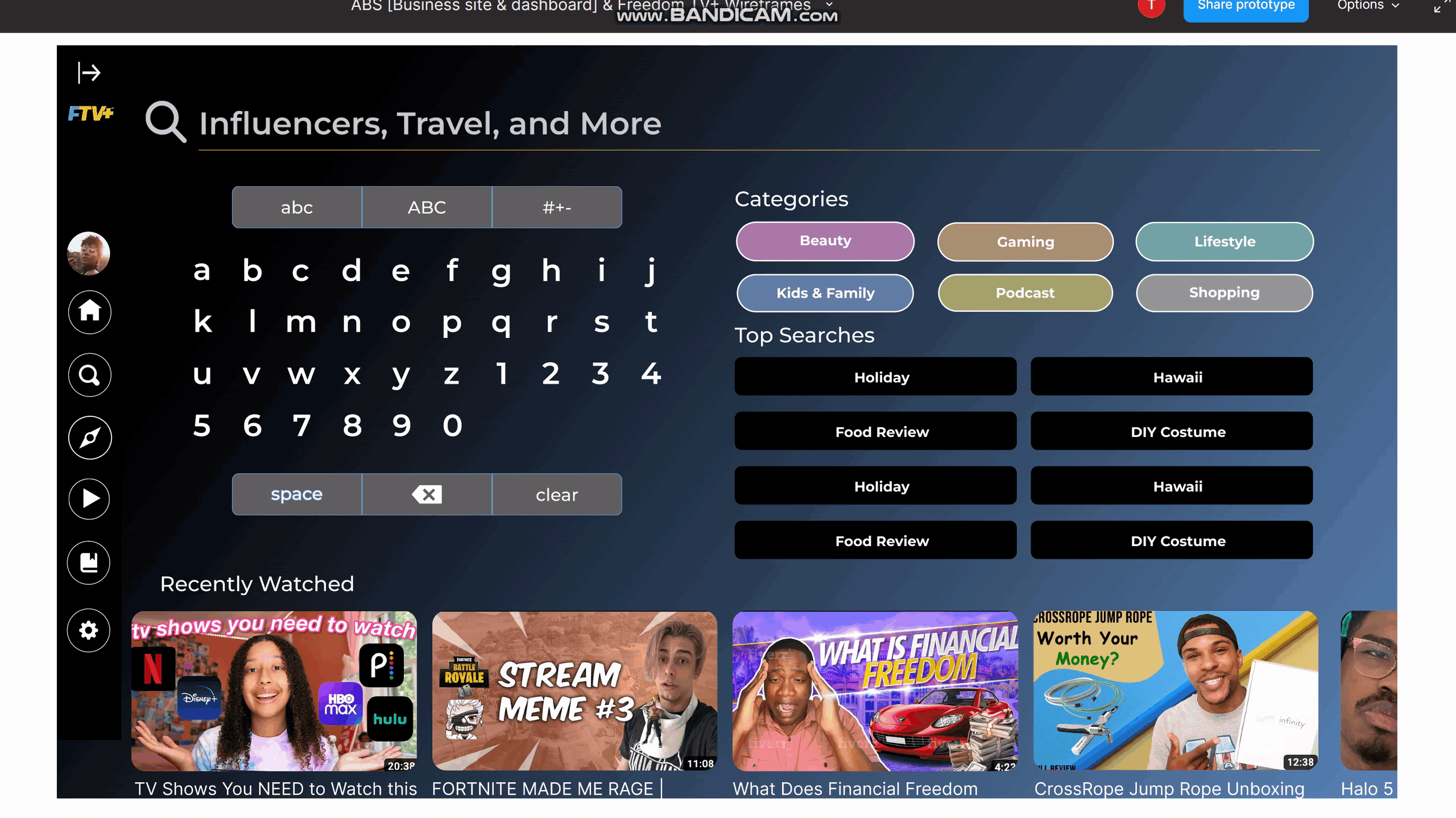
Search Page
Keyword Suggestions
Give users more ideas on their search
Bigger Keypad
Make it easier to type, especially for people who have disabilities.
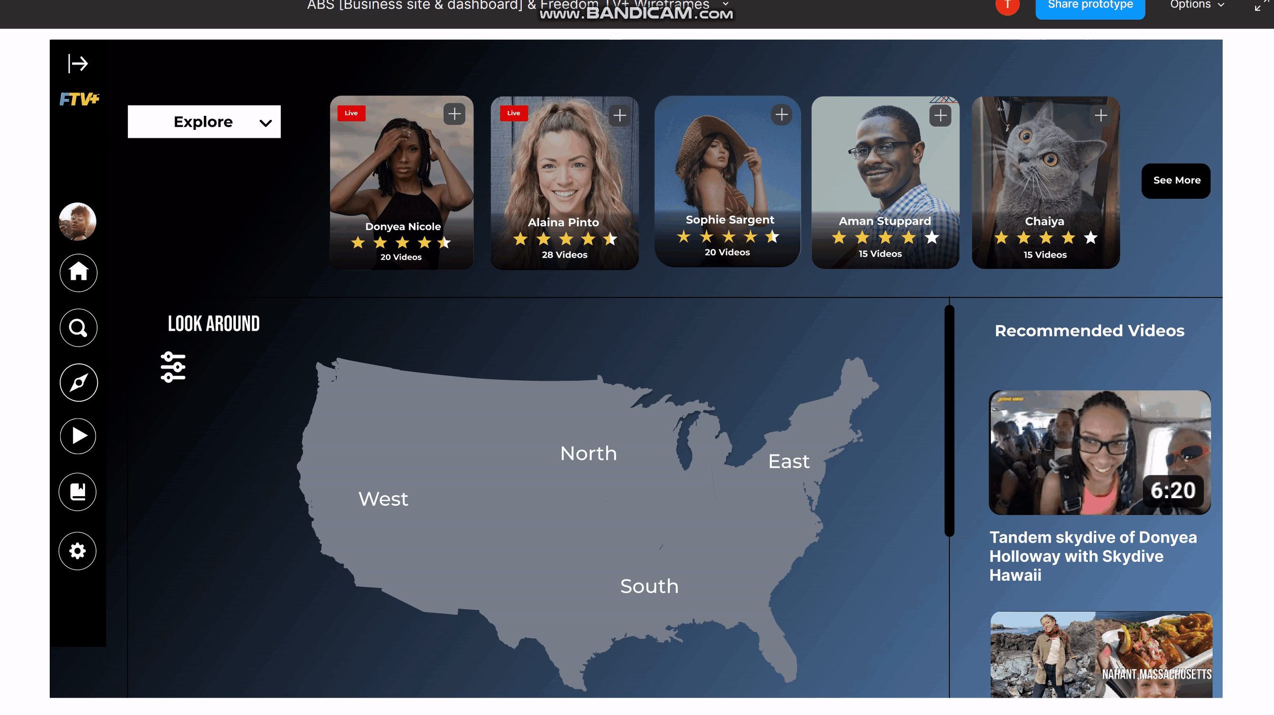
Explore Page
Explore Influencers Feature
Users can explore new influencers by using the filters that will show popular influencers in different categories. This will help promote all the new content creators to discover more from the users.
Look Around Feature
Users can see popular videos by selecting locations they might want to explore. The recommended videos will change follow to the location user has set.
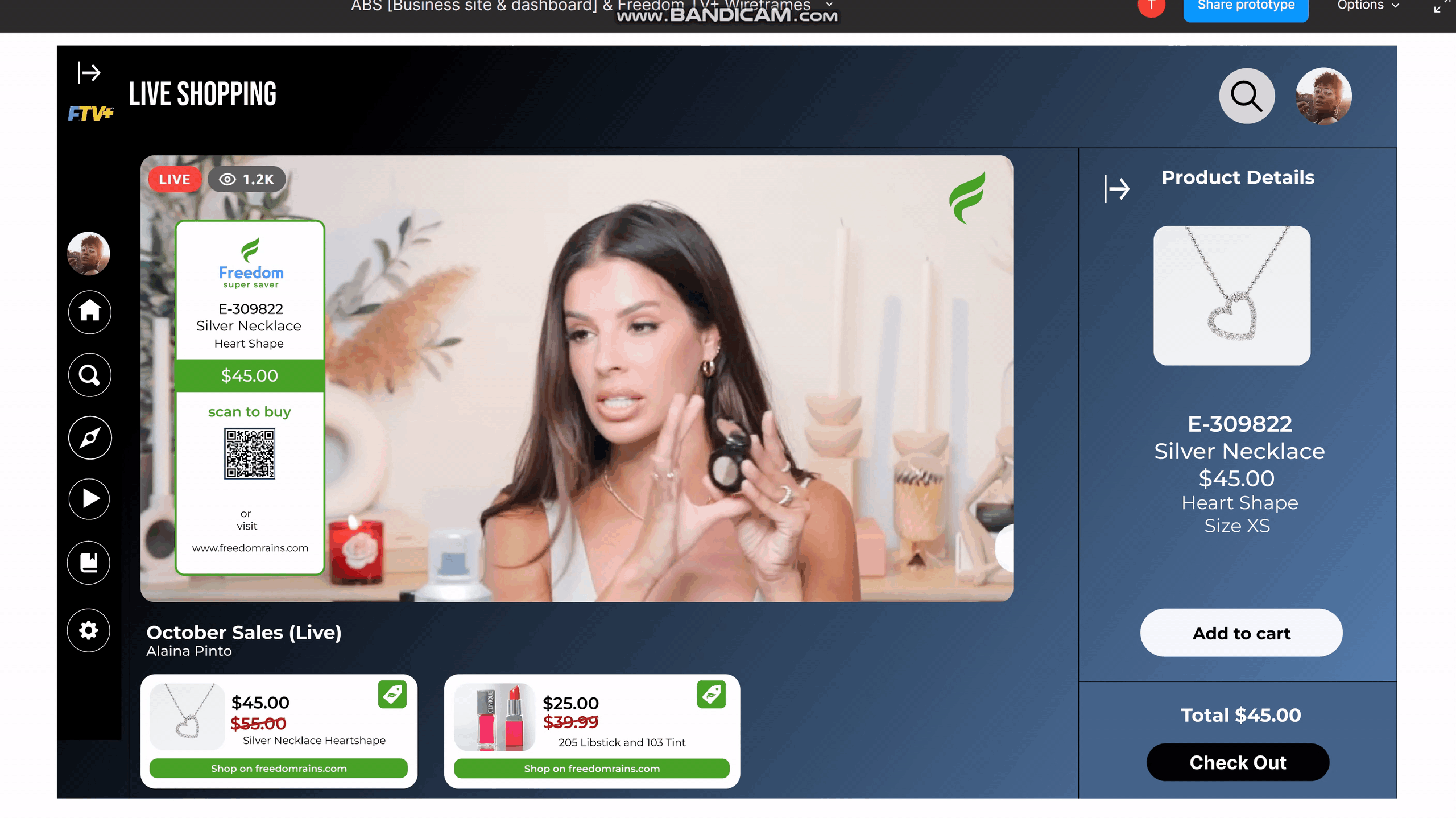
Live Shopping Page & Check Out Page
Search Page
Added suggesting keywords feature and designed bigger keypad system to make it easier for users to uses on TV
Explore Page
Explore Influencers Feature
Users can explore new influencers by using the filters that will show popular influencers in different categories. This will help promote all the new content creators to discover more from the users.
Look Around Feature
Users can see popular videos by selecting locations they might want to explore. The recommended videos will change follow to the location user has set.
Live Shopping Page